One of the best features of Weaver II WordPress Theme is the large number of Layout Options it offers. The term Layouts in web design includes design features such as, the number of sidebars you have, the location of sidebars (right or left), the width of sidebars, single or double sidebars, and the width of your Content Areas (where you write your stuff).
You probably know what Fonts are already, but anyway: Fonts are the style of the letters of your text, and also the Size of the text. I’ll cover Weaver Font Options after I’ve covered Weaver Layouts.
Layout
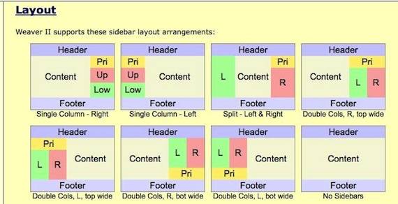
Here is a screenshot from Weaver’s Help files to show the Layout options available.
The sidebars support three widget areas (Primary, Upper/Right, and Lower/Left). There are other widget areas supported, and will be described in upcoming posts.
My Second Million is using a single sidebar located on the right hand side.
How To Customize The Width of Content Areas and sidebars
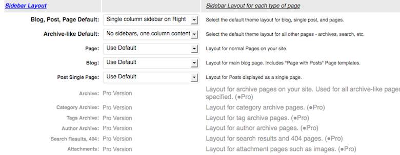
These are controlled in Dashboard>Appearance>Weaver Admin>Main Options>Layouts: see screenshot below:
Here is how I have customized my Layout Settings for My Second Million.
Theme Width:
I have set my Theme width to 1060px which is slightly wider than the Weaver Theme default width of 940 pixels.
In the case of My Second Million the Theme width is also the width of the Header Image. If you change the Theme Width here, the Header Image width is automatically changed as well.
Theme Width Fixed
I have left this check box unchecked…because I didn’t understand the instructions explaining what it does, and I didn’t need it.
Good news friends! The nice guys over at the Weaver Forum have just explained this function to me.
The Admin Panel>Layouts>Theme Width Fixed check box instructions says:
Force the theme width to be fixed (use CSS “width” instead of “max-width”). Using this option is not recommended. This setting will also “break” the Mobile View, so you should disable Mobile Support as well.
Translated for beginners, this means:
Theme width fixed means that the site will not scale down and adapt to the browser width, it will always stay the same width. As the browser window gets smaller, the site will therefore get clipped and you will get a horizontal scrollbar.
So I did the right thing originally after all. Did I mention how great the Weaver Support Forum is? It’s great. Login is next to ‘Discussions’, and Start a New Discussion is half way down on the right, at the bottom of the red banner: Posting Guidelines and Vanilla Help.
Theme Margins:
I kept the default Theme Margins: (Top and Bottom, and Left and Right) with a width of 20px because it looked OK. These Theme margins check boxes control the width of the outside areas which happen to be a dark blue color in My Second Million. Theme Margins surround the Theme width Content areas.
This dark blue surrounding Background color was chosen in Main Options>General Appearance, and was covered in the previous article: Unofficial User Guide: Weaver II Installing Weaver.
Wrapper Padding:
I reduced the Wrapper Padding from the Default width of 10px to 5 px because I thought it looked better.
But what is the Wrapper Padding, I hear you say….I found that out by changing the width in that Wrapper Padding Check box and seeing what effect it had on the website design. Here is a screenshot with arrows showing you the wrapper padding of My Second Million:
On My Second Million. it’s that white margin around the whole Theme. And on My Second Million, it is best seen between the Background dark blue, and the Header image at the top of the Page. (Sydney skyline image plus Text added and size changed to fit Header area, using Mac Preview).
My Sydney skyline image was initially not quite wide enough, and did not fill the header image space I’d set by using the Site Width in Admin Options>Main Options>General Appearance. So I made it wider in Mac Preview app. Now it fits with no space around it when uploaded into my Header area.
To see how to do that, check out:
- How to Make Logos with Mac Preview App and
- How To Resize & Shrink Photos in iPhoto & Mac Preview App
Sidebar Layout
My Second Million has Single Column Sidebar on Right:
Blog Page Post Default:
This is where you choose the type of Content area and sidebar location. My Second Million uses Single Column, sidebar right.
Archive-Like Default:
this setting controls the layout of the Pages that are not the Home Page and Single Post Pages etc.
For example: Archive Pages, and Search result Pages. If you type something into the Search Box at the top of this page, and search, you will see what a One Column Content, no sidebar Page looks like with this setting.
There are other Weaver Pro options in this Layout Admin area. From my experience of 9 month’s use of Weaver free, I have not needed to have, or know about these extra options to set up My Second Million. But you can always upgrade to Weaver Pro if you want to get some more options to experiment with.
I will probably be upgrading soon, mainly to have more options for Fonts, but first I have to get this User Guide done and dusted.
The only other option to be chosen in this Layout section of Weaver Admin Options, is
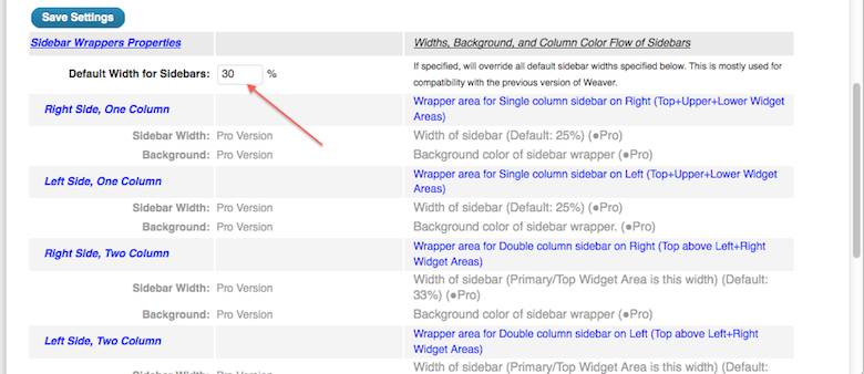
Sidebar Wrappers Properties
Default Width for Sidebars:
I have mine set at 30%
To be honest I can’t remember what the default setting was, but I think I increased it to get to 30%. Increasing this option increases the width of the sidebar. You will notice that the width is in Percentages. This does make life tricky if you want to know how wide your sidebar is in pixels, which is what you need to know if you are going to upload Banner Ads and Subscribe Forms into your sidebar.
I worked out the width I needed by uploading a Google Ad into a widget in the sidebar and then I could see if the Banner ad was chopped off by a too-narrow sidebar.
By experimenting, I found that with a Theme Width of 1060 px, and the Default Width for Sidebars set at 30%, I could fit in a Medium Rectangle sized Google Adsense banner ad (300 x 250 px) into the sidebar with a slight margin to spare.
I assume that if you choose a narrower Theme Width in Dashboard>Appearance>Weaver II Admin>Main Options>General Appearance>Theme Width, you will have to increase the Percentage settings here in Main Options>Layout for your Sidebar width, if you want to have an Adsense Medium Sized ad in your sidebar.
The best way is by Trial and Error using a separate open Tab (with your Home Page visible), so you can make changes in one tab screen (showing Admin Options), Save Settings there, and then check the results on the second open tab screen (showing Home Page) by refreshing it, and seeing the results of your tweaking.
Once again, there are more options available for sidebars if you upgrade to Weaver II Pro, which are greyed out for the Free version that I am using. Their use is not covered in this article. So we can move on to……Fonts! Yes!
Fonts:
these are located next along the Admin Main Options Menu after Layouts, at
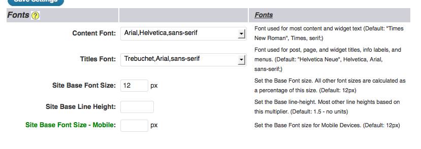
Dashboard>Appearance>Weaver Admin>Main Options>Fonts:
The Weaver default Font size is 12 px and that is what My Second Million uses. It’s easy to experiment – just change the font size, save settings and see how it looks. If you don’t like it, just change it back again. It’s easy, and a personal choice.
The same goes for the Content Font and Titles Font choices. There are lots of Fonts to choose from. I sometimes change the Titles font on the individual Post’s Edit Page if I think that my default Font is not looking quite how I want it. But I always stick with Ariel for the Content font – like 99% of all other bloggers.
Alright! Layouts and Fonts are done! And today, I will not reward myself with some well earned chips…..No, tonight I’m going for… a Chocolate Tim Tam! Yes! (Besides, I already had some chips earlier, but don’t tell anyone).
Disclaimer: Please do not take my reward choices as personal advice…and if you do…don’t blame me, it’s not my fault, and I am in no way liable for the outcome. Just to be clear.
Why not Subscribe to our you-beaut Newsletter – it’s easy and it’s free! To keep in touch with the latest at My Second Million, just click on the Subscribe Button below, and check your Spam folder if you don’t get a Confirmation Email within a couple of minutes.





Pingback: Weaver II Unfofficial User Guide: Content Area Options
Pingback: Weaver II Theme: Unofficial User Guide: Index & Links
Thanks for great explanations. This really helps me figure out Weaver II Pro.
Glad to hear it -that’s what I tried to do.
Hi Carol,
How have you been?
I am stuck once again, and so I am back.
I am in the process of developing a “subdomain” as a new site.
I am using mostly “meteor Slides”, for most of my pages, and without any Sidebars.
However, for one particular page I wish to make the Content are with Two Columns. The purpose is to have thumbnails of images that will point to specific blogs only. This will give me the freedom to change the content of this page without having to delete any of the images and without damaging the SEO.
Now the problem : On the WordPress PAge Editor, I have the option to select “2 Column Content” under Page attributes. But it does not seem to work, or may be I cant figure out how it works. Even after selecting this option, the page looks as usual…with a single column. Can you please help me?
Regards.
Soumen
Hi Soumen, I haven’t used a 2 column Page so I can only read what it says in the Help Section: Weaver Page Templates.
It looks like you have to split up your content with page breaks for it to work. Have you tried that?
Also, have you tried using a Gallery Page Template to see how that looks?
Hello
how can i display image or slider outsite layout
image or slider 1400 but layout only 1150
how can i display a 14oo slider in header
thanks
Can you change the width of either the slider/image or the header space? If not maybe ask at the Weaver support site – I haven’t put a slider on my site so I don’t have experience with them.
For my own header image, I reduced the size of the original image using the Preview app on my Mac so it fitted ok.
Hi Carol
I really appreciate the time you took to put this article together. It was of great help for me. I came back to your site quite a number of times to check for answers to my questions on WeaverII. I have to say that you explain things in a simple, yet effective manner.
Are you a born writer?
thanks again.
Lucie
Thanks Lucy. Born writer? Well, I was definitely born, and I learned how to write at school…apart from that, who knows!
And you have a great sense of humor. What you have put on this blog or may I say training is highly valuable and for that I thank you. Clear explanations and direct to the point. Great stuff.
Thanks Lucy. From my day one of blogging, I decided it would become a great resource if I documented in detail, every new thing I learned as I worked out what I needed to do to set up a blog from scratch. Sometimes these days I have to go back and re-read my own posts to remind myself how I did some complicated ‘geeky’ stuff that I worked out at the time, but have since forgotten
This is a great tip. I started writing things down a couple of weeks back, but I should have done at the start of my journey! I have done many things and thought I would remember. I ended up having to re read the things I already learned. Felt a bit like a prisoner. I since then document each and everything I learn so that I do not have to repeat it.
Hi Lucie, better a few weeks late than never! My Second Million is written in date sequence of the things as I needed to learn about, do, and write about as I found I needed to do them to improve the site. This means that if beginners want (or need to) start where I started back in 2012, and then proceed to add refinements to their own beginner blogs as I did.
Or people can use the search option in the top menu if they need to know a specific topic.
Thanks for all of your comments. Your reply is always greatly appreciated. I will go on and try my best on my journey
Excellent help