 Installing and using any new WordPress theme is always a big leap into the unknown. Yes, there are Demos and Support pages, and Forums, but it’s when you decide to finally click ‘Install’, so you can test drive a new theme for the first time, that you feel the stress. But.. good news, friends! The free version of Weaver II is so easy to install and set up you will wonder why you waited so long to give it a test drive.
I installed and set up Weaver for the first time when I had been a blogger for 3 weeks only. It took me around 3 hours to set it up – while I was also watching the tennis (Federer won). If I can do it in 3 hours with 3 weeks of experience with WordPress, anyone can do it. If you can see a screen, read English, and wield a mouse, you can set up Weaver II with no trouble at all. No HTML, CSS or cPanel required. It’s easy as – Aussie expression meaning ‘Any idiot can do it’ (a rough translation).
Introduction
This Unofficial Weaver II User Guide is based on the Admin Panel of the Free version of Weaver II. That is what I am currently using, although I will probably upgrade to the Pro version soon. Why? Well I don’t really need to upgrade to Pro, because the Free version has served me well for my first 10 months of blogging, but the Pro version gives blog owners a lot of extra options. Such as more Font Control and other options that would be useful, but not essential at the outset….in my view.
Disclaimer: At the outset I’d like to stress that the views I express here are my own views based on my own personal experience of only 10 months of blogging, and nine months of Weaver use. So of course, I don’t know how to do many fancy web design tricks, or use all of the many features that come with Weaver II .
But, I have learned the basics that any new user of Weaver will want to know when they first start using Weaver. So if you are a beginner and want a Starter Guide for Weaver II, you’ve come to the right place.
And this Unofficial User Guide only documents how I have my own blog set up. You can use it to understand how Weaver works in real life, and to know how and where the design options are located. I also get no financial benefit of any sort, or any other kick-back from writing this user guide. But I’m always open to offers. 
I don’t know how many posts it will take me to go right through the Weaver II Admin Panel, it’s Options and my Settings. But I’ll start at the beginning and keep going until I get to the end. Buckle up, friends…we’re going in!
How To Install Weaver II Free version 1.2.3
This Weaver version 1.2.3 is the latest version at the time of writing (November 2012), and I’m using WordPress version 3.4.2 which is also the latest version.
You will already have Registered a Domain Name, and signed onto the best Hosting Account currently available on the planet: Hostgator. You will already have installed WordPress onto your Domain – and it will probably have the default WordPress Twenty Eleven Theme that is installed as default on new WordPress installations.
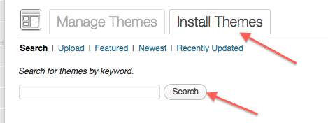
1. Go to Dashboard>Appearance>Themes>Manage/Install Themes:
3. Type Weaver II in the Search Box. The choices of Weaver Themes available will be displayed. Click ‘Install’ for the Weaver II v 1.2.3.
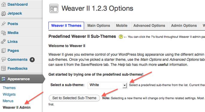
4. Go to Dashboard>Appearance>Weaver II Admin>Weaver II Themes
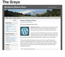
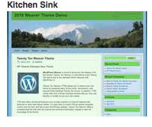
5. Choose a Weaver Sub Theme. You can see the Thumbnails that show you different Color Schemes and layouts.
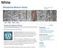
This blog uses the White Sub Theme. I believe that the Blank Canvas Sub Theme is similar.
6. Select the Sub Theme of Your Choice. Whichever Sub Theme you select to start with, you can tweak the design, layout and color schemes using the Check boxes in Weaver Admin in any way you like. Or reselect a different Sub Theme at any stage later on. OK, first Stage done. Now to start to customize our Theme.
Weaver II Free v 1.2.3: Main Options
Below you can see the Weaver II Theme Headings Menu and Sub Menu Index that runs across the top of every screen in Weaver Admin.
Main Options: The overall options that affect site’s General Appearance, including main background colors, rounded corners, Borders, the Search Form, and alternate style sheet.
A useful tip is to have second browser windows open, with your theme loaded in both windows. You can tweak your settings on one window screen, and check out the effects on the second browser window (you have to update that second window before you will see the tweaks you made in window one, show up in your other browser window. theme screen). In that way you have a side by side comparison of the Before and After effects of your tweaking.
This screenshot below is the top half of the Weaver Admin>Main Options>General Appearance screen.
General Appearance:
This screen shot shows the Settings I have for this blog.
Notice as well: this screenshot shows you a typical Template you will see for whole of the Weaver Admin Panel: In particular, Weaver uses:
- Check Boxes to check (or not)
- Color Choices: you don’t need to know the HEX number for HTML colors.
- Click in the color bar (1) and the Color Picker screen drops down. Use your mouse to click on the color that you want. The Selected Color will show in the horizontal color bar, and the HEX number is automatically added as well.
- Click on the CSS+ sign (2) and you get a text box opening up, where you can enter your own CSS styling if you want to. This is not something beginners need to worry about. It’s there for the clever-clogs designer geeks to have fun with.
Now To Start Tweaking!
1. General Appearance From the Top:
Outside BG: this is the color of the margins that you see on either side (outside) of your Content Areas where you write stuff. It’s dark blue on this site of My Second Million (#2753A0).
Default Text Color: the color of the written text you use, and read. My text color (#444444) is not quite black. Color #666666 is even less black. Color #888888 is a dark grey. Many bloggers choose a not-quite-black text against a not-quite-white background. This is a less stark contrast than full black on full white, and is probably easier on the eyes when reading over time.
Main Area BG: Color #FCFCFC is my not-quite-white background color. Anything similar will do. Unless of course you want something completely different. Such as white text on black background, and anything in between.
This Main Area BG also covers the sidebar backgrounds too, but you can change sidebar colors later in ‘Widgets’ if you want to. See Weaver II Guide: Widget Area Settings.
Round Corners: the best way to see how these work is to check the check boxes and see if you like effect that this option controls. I’ve chosen to not use Round Corners. It’s your choice.
Fade Outside BG: check this and your background color becomes gradually lighter as you scroll down the blog’s screen.
Wrap Site With Shadow: I have this checked too. It adds a touch of drama to your blog… maybe.
2. Borders: Border Attributes for various areas:
You can see that I have left both these Check boxes unchecked. That is because I like the cleaner look of having no borders (lines) around the different areas on the page.
Experiment with the options, and decide which you prefer. Always click Save Settings after every tweak. Then refresh your second open web page to see what effect each tweak has done.
Below this ‘Borders Attributes’ section are some Weaver II Pro Options that are greyed out in the Free version. So we don’t have to worry about them here.
OK, that’s the end of Unofficial Weaver II User Guide: Part 1 – Installing the Theme & General Appearance.
The next article will cover Weaver II Theme: Layout and Fonts
Want to sign up to our Newsletter so you won’t miss out on the latest MSM News? Of course you do!
Just click on the Subscribe below and get updates right into your Inbox. If you don’t get a confirmation email within minutes, please check your Spam Folder.




Pingback: Weaver II Theme: Unofficial User Guide: Customize Content Areas
Pingback: Weaver II Theme: Unofficial User Guide: Index & Links
Best guide book for wordpres newbies.