Content Areas are where you write your text. You can choose to have Single Column content areas, or double Column Content Areas. You can have sidebars on the right or left or split sidebars – split between right and left.
Those basic layout choices were covered in the article Weaver II Unofficial User Guide: Layouts & Fonts. Other options relating to your Content Areas such as the Main Area background color, Default Text color were covered in Weaver II Unofficial User Guide: Installation & Main Options.
This Admin section called Content Area Options covers everything else, including Titles, Headings, Padding, Images, Lists and Tables, and User Comments. These options in Content Area Options apply to both Posts and Pages.
Note: a Page is usually a static page such as an About page, or a Sitemap, or a Contact Page or Category Pages. A Post is an article that is normally posted on your Home Page in date sequence.
It is normal for the latest Post being at the top of your Home Page, and your oldest Post being at the end (beginning) of your Blog, although you can reverse this order if you want to.
How to Customize Weaver Admin: Content Areas.
Your Weaver II Content Area options are found at Dashboard>Appearance>Weaver II Admin>Main Options>Content Areas.
If you click on that yellow Question Mark you get taken to the Weaver Help Pages. Here is an extract from the Weaver Help pages dealing with Content Areas:
Note: this Admin Content Area section includes an Option setting called Page Title Text (covered below). As explained in the Help extract above, this setting only affects only the Page Titles on Static Pages.
This should not be confused with controlling your Blog Post Title Text settings.
The titles of your Blog Posts on your Home Page, are customized in the Admin section under Links: Dashboard>Appearance>Weaver II Admin>Main Options>Links>Post Entry Title Links and is covered in the previous article: Weaver II Unofficial User Guide: How to Customize Links.
That might seem confusing, but Blog Post Title options are included in the Links section of Weaver Admin, because each Blog Post Title is also a Link to the Full Page version of each Post.
OK first cab off the rank in Content Area is Text Related options:
1. How to Customize Weaver II Content Area: Text
Admin options here are similar layouts to all Admin Options for Weaver II: Check boxes, Color Pickers and options to add CSS tweaks (Cascading Style Sheets) if you want to, and if you can.
As with all Weaver options, you do not need to know anything about CSS (web design language) or HTML Code, to set up a beautifully designed website. Everything in Weaver Admin is customized using only your mouse.
1. Text:
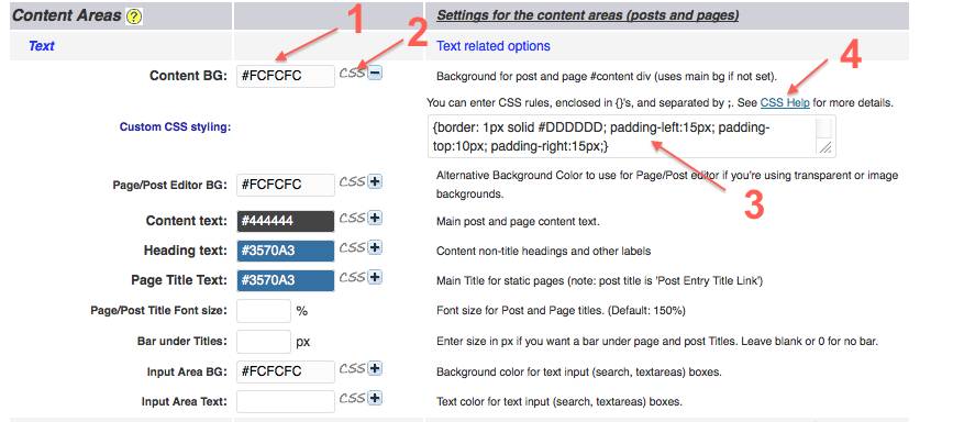
A: Content Area Background. Here again I have selected my standard off-white background (No 1). I have set the same not-quite-white background color for all backgrounds in My Second Million. That gives the whole site a consistent and uniform appearance.
If you leave this Content Background option blank, the background color you selected when you customized your Main Area Background Color in Weaver Admin>Main Options>General Appearance, will be your background color for your Content Area. I have both set to the same off-white color, just to be sure. 
No 2: CSS+/- Once again, the Admin Options layout here follows the standard Weaver Admin options layout. If you click on the + sign here, a text box opens up (No 3) where you can add your own CSS instructions – if you want to and if you can.
In this case, Weaver admin has helpfully added some Custom CSS as default:
| {border: 1px solid #DDDDDD; padding-left:15px; padding-top:10px; padding-right:15px;} |
This CSS instruction controls the appearance of borders and padding, if or when, you choose to select borders when customizing other options further down the Weaver Admin Content Area section.
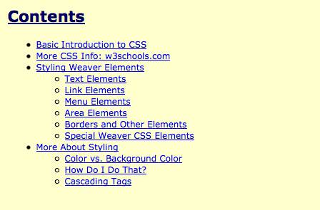
As always, Weaver provides a Link to their CSS Help section (No 4) in their Help Pages, in case you want to use or learn a bit about CSS. Here is a screenshot of the Weaver CSS Help index.
Moving down the Content Area options page, the next item to customize is:
B: Page/Post Editor Background Color: this is the background color of your Edit page when composing and editing your articles in WordPress. I have selected the same off-white color as elsewhere.
C: Content Text: I’ve selected the same not-quite-black color #444444 that I also selected in Main Options>General Appearance as my Default Text color.
D: Heading Text: this controls the color of all headings that are not Title Headings, and/or other labels. Here again I have selected the same blue as elsewhere (#3570A3).
You can override this selected color for non-title Headings and labels (if you want to) when you are composing and editing your blog Posts, by installing and using the Ultimate TinyMCE plugin.
The Ultimate TinyMCE plugin is one of my Absolutely-Must-Have Plugins – don’t leave home without it! You can read about my essential plugin recommendations at Plugin Review: Best Free Must Have Plugins.
E: Page Title Text: this is the option I discussed earlier in this article. It controls the Title Text on Pages, but not Posts. You customize your Post Title Text in the Admin Links section. I have again selected my standard blue color here.
F: Page/Post Title Font Size: I have left this option as the default font size of 150% because it looks OK to me. If you want to, you can select a different percentage sized text (a percentage of the Font Size you selected in Weaver Admin>Main Options>Fonts).
G: Bar under Titles: I have left this blank so my Titles don’t have bars under them.. Leaving this option Blank or Zero, sets no under-bar. A number in Pixels (for example 1px) here would select a bar under Titles for Posts and Pages.
H: Input Area Background: this controls the background color of ‘Text Input Boxes’ – for example, Search Boxes. I have selected the same off-white color: #FCFCFC.
I: Input Area Text: I left this blank so my default Text color (#444444) set in Main Options>General Appearance, applies.
2. How to Customize Weaver II Content Areas: Padding and Spacing
2. Padding & Spacing: this option controls the spaces around, and between elements in your Content.
A: Content top and bottom padding: I’ve left this option blank, so the theme default applies. You can see what a different setting for top and bottom padding looks like, by entering a number in these check boxes, click ‘Save Settings’.
Then Refresh your website, and see if you prefer the ‘look’ of a different size of padding or not.
B: Content left/right padding: I’ve left this as default as well (blank). Again, there is no harm in adding numbers here and checking to see if you prefer different left and right padding.
Experimenting with Weaver is really easy to do, and really easy to undo – you just change the numbers back to how they were before (blank in my case) and Save Changes.
C: Space between Title and Content: (No 1) the default setting here is 1.625 em. I reduced that space to 1.00 em which makes the text of the Content a little closer (higher up) to the Headings of Posts and Pages. You can easily choose to change this setting or stay with the default setttings (1.625 em).
Note: i had no clue (and still don’t know) how big an ’em’ is, so I just experimented to see how the website looked with different numbers until I thought it looked OK.
It’s the same story with pixels – experiment and choose what looks good – a bit like life really……[Stop that, Carol! You were doing so well..now Focus!] …Oh, all right…
D: Space after Paragraphs and Tables: I’ve left this as the default of 1.5 em. All your choices about padding and spacing are individual choices, and Weaver makes it very easy to change these settings.
3. How to Customize Weaver II Content Areas: Images
3. Images:
A. Image Border Color No 1: You can choose to have borders around your images if you want to. You can see how this works in the above screenshot.
If I had left this image border option blank, the screenshot above would not have any border around it, and it would be difficult to see where the screenshot ends and the Content of the Page starts.
I have set this Image Border color as mid/light grey (not black or almost black). This helps to lighten and soften the ‘heaviness’ of the border, to reduce the contrast between the image border and off-white background.
Although you may not want (or need) a border around images that are ‘real’ images/photos/graphics with their own colors, a border can help define separate content areas when the image has the same color as your background color.
B. Image Border Width: No 2: I have set this as 1 px, which is the thinnest border you can have. If you were to put 2px or 3px here, your image border will be heaver (thicker).
C. No Image Borders: No 3: Blank: Here you can choose to not use Borders or Shadows around images if you want to. If this option is left blank, like I have, you will get Borders and Shadows (see below) around your images.
I have left this blank because I do have (and want) Borders selected at No 1 in the above screenshot.
Shadows: However, although I have ‘allowed’ (not blocked) Shadows around Images at this option (C) by leaving this option blank, the Shadows around images option is master-controlled in the next option (D).
D: No Image Shadows: No 4: I have this check box Checked, because I don’t want shadows around my images. Checking this option blocks Shadows around Images that I ‘allowed’ at option B above (No 3).
This option over-rides the blank No Image Borders (and Shadows) above (No 3).
The result of this combination means i have thin (light) grey borders around images, but no shadows around images.
E. Caption Text Color: this color choice controls the color of the text of any caption under images. You only see a title under images if you choose to add a title to your images.
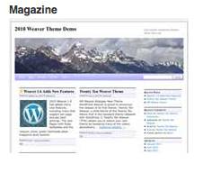
Adding a caption (title) to your images is done in your WordPress Upload an Image function. You can see how this looks by examining the title text I’ve added under the Weaver Sub Theme image at the top of this article.
4. How to Customize Weaver II Content Areas: Lists, <HR>, & Tables
4. Lists <HR> Tables
A: Content Lists: Bullet: (No 1) this is where you select the type of icon for Unordered Lists (Bullets). The choices are Filled Disc (default), Circle, Square, none or Custom.
B: <HR> Color: (No 2) this option controls the color of a page break if you choose to break up the text of your content. See the thin line below.
You make a page break like that (the thin line above), by selecting the HTML view of your Edit Page (not the Visual view) and type <hr> (or <HR>) where you want to add the page break. Then change back to Visual View and you will see the line of the page break as above.
I have selected the color #555555 for page breaks, which is slightly less black than my default text color of #444444.
C. Table Style: (No 3) I’ve left this option as the Weaver Default style for tables. Other available options are Bold Headings, No borders, Wide, Wide 2, or Minimal.
5. How to Customize Weaver II Admin Content Areas: Comments
5. Comments (the last option to customize in Content Area Options  )
)
As always, no nasty surprises here from Weaver Admin.
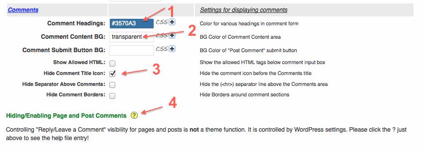
A. Comment Headings: (No 1) I’m using the same blue color as all other Headings: #3570A3.
B. Comment Content Background: (No 2) I see have this set as transparent. A transparent setting allows the color of the ‘layer’ below to show through. In this case my Default Background Color of #FCFCFC (off white) will be showing through this transparent setting.
I could have selected #FCFCFC at this option, but I must have left it as it came (default), because in my case, the result is the same. If you wanted a different color for the background color of your Comments section, here is where you would select it.
C. Comment Submit Button Background: this is the background color for the Submit Post button. I see I’ve left this option blank – hmmm…. there are a lot of options to customize when setting up a website (my excuse). It’s not difficult, but there are quite a few. I was probably skimming a bit by this stage.  If it had looked ‘wrong’ on the Comments area, I would have come back here and added a color for this option.
D. Hide Comment Title Icon: (No 3) if you Check this Checkbox you hide the icon you can see in the screenshot of my Comments section below.
I chose to hide that icon, so I did check this Hide Comment Icon option.
E. Hide Separator Above Comments: if you choose to Hide this separator line above Comments, the top of the Comments area looks like this:
You can see from the arrows where the separator line would be if you chose to have one. You can compare the appearance of the Comments Section both with and without a Separator line, by comparing the last 2 screenshots above.
The screenshot for (D) above does have a separator line, and the screenshot for (E) above, does not.
F. Hide Comment Borders:
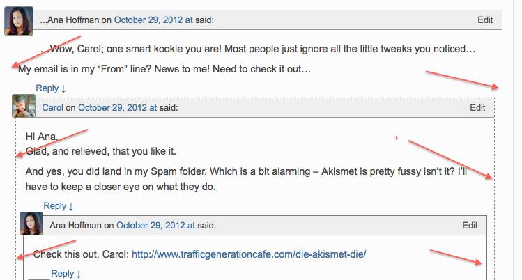
If you choose to Hide borders around your Comments by checking this check box, your nested Comments (Comments with Replies) look like this:
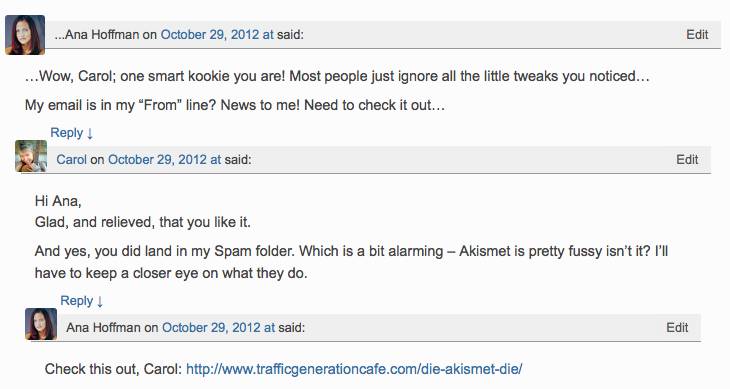 Here’s what nested Comments look like if you don’t check this Hide Comment Border Check box. The result is that you do add borders to your Comments:
I’m not certain about the Pros and Cons of having borders around Comments. I have currently left the Hide Borders option unchecked, so I do have borders around my Comments Section. I did that because it makes it clearer when someone is replying to an already posted Comment, as opposed to a new Comment.
But it does make the Comments area look a bit cluttered. So I may change this option in the future, but I don’t think it’s very important design feature for My Second Million.
With Weaver, you can always choose, and you can easily change your mind later. One of the best things about the Weaver Theme is that is so easy to drive, even for Learner Drivers – no nasty crashes or bent fenders with Weaver.
Wow, that is another marathon article in the can. All done and dusted. But wait….Oh no…..there’s more!
Right at the end of the Comments Section of Weaver Admin>Content Areas is this:
Which is another screenshot showing the same No 4 that you can see in the earlier screenshot (back 5 screenshots).
G. Hiding/Enabling Pages and Post Comments: that yellow question mark takes you to the Weaver Help Pages. There, it explains how Hiding or Enabling Comments is a function of the WordPress platform, not the Weaver Theme.
However the Weaver Help section does give instructions about how to customize your WordPress Comments to Hide Comments on Posts and Pages. I won’t include that here.
P.S. a Post like this one, that is 2,680 words long breaks all the ‘Rules’ of Blog post writing. I suppose it’s the equivalent of a blogger’s suicide note. I must say, I do feel a bit drained, but definitely not suicidal, so not to worry, friends!
So, for those trusty readers who are still awake (if there are any), and still paying attention…..Congratulations! Phew! I think we all deserve a break. I’m going to put my feet up with a strong cup of tea to restore me to my former…..whatevers.
Don’t forget to Subscribe to My Second Million by clicking on the Subscribe Link below, and check your Spam Folder if you don’t get a Confirmation Email within a couple of minutes.







Pingback: Weaver II Theme: Unofficial User Guide: Index & Links
Hello! your site is great. I found you through B-School. I’m building my wordpress site now using weaver II and I’m having a really hard time figuring out how to manage the layout of the images on my posts. For the moment they are just visible as thumbnails. I’ve looked in dashboard/appearance/weaver II admin/content areas also in the settings areas … I’m sure I’m missing something really obvious but after two days of watching videos and searching I’m still not getting anywhere. Can you help me?? Many thanks!! Elizabeth
Hello Elizabeth, oh dear! It’s infuriating when you cannot get software to do what you want it to do, or to not do what you don’t want it to do – and when this happens to me I don’t know whether to hurl a brick at the computer or burst into tears – or both.
So, I have a few suggestions:
I see that you have larger images in your Galleries but they show up as thumbnails (150×150) when seen on the Home Page.
First, at Weaver Main Options>Content Areas>Images>Featured Image (I see that Weaver has tweaked these options slighly in their latest version) check to see what settings you have there for ‘Featured Image’.
I have these set as unchecked for ‘Hide Featured Image on Pages’, and ‘Featured Image width on Pages’. The middle setting of ‘Page Featured Image size’ I have set to Medium – not Thumbnail which is the Default setting. I’m not sure how important those settings are, but I have never had the sort of image size problem you are having.
The other thing to check is how you upload your images into your Posts. There are 2 methods of doing that.
1. You can upload images using the Featured Image option in the right hand side bar on the Editing Page. I don’t usethat method. I used it when I started out, but I have never been certain what limitations that puts on images you upload. It never caused any problems of size for me, but the preferred uploading option is at the
2.’Add Media’ icon/tab at the top left above your rows of formatting icons. I always use that method and find it works well.
When you upload images, you can change the size of the image during the uploading process, when you are adding Alt Text and Descriptions, in the Edit Image section.
It is best to decide on the size of the image before uploading and use the full size in WordPress, rather than upload a too-large image and the reduce it’s size in the Edit Image options. This can slow the loading speed of your website.
For a detailed explanation of that, see the article: How to Optimize Images for Max Speed and SEO.
I hope these suggestions fix the problem for you.
By the way, where in B-School did you find me? I had never heard of B-School before.
Carol.
Hi Carol,
So kind of you to make a reply. That gives me courage to ask one question.
1) I see that your Weaver II blog is wider than mine. Is there a way to increase the width of my site and blog (both) ?
2) I am a photographer and mine is a Photographers website. I need to display larger images.
Is there a way to make my images look larger ?
A heartfelt thank you to you for your time.
Regards
Soumen
Hi Soumen
1. I have a whole Category of articles that covers everything you need to know (almost) about basic use of the Weaver Theme. The width of the page and Sidebar is controlled in section of the Theme admin: Main Options> Layout.
2. I have a whole Category with articles on Website Design and Image Editing. I’m no photographer so assuming you cannot control the size of your own Photos with your camera, you can resize shrink images using Mac Preview app if you have an Apple device of some sort.
You could probably increase the size of images using the Preview App as well.
Check out this article: How to Shrink Images Using iPhoto and Preview app.
There are also free Image editing software online, such as GIMP. But don’t ask me how to use GIMP I haven’t worked that out yet.
Many thanks Carol for your prompt responses. You are helping me like no one ever did to me. thanks again.
I can control the size of my images. I can make them as big as I want, or make them as small as I want. But once loaded in my website, they seem to have a maximum size defined somewhere and they do not get any bigger even with a larger sized image. I cant figure out where exactly to make a change so that I can make them look bigger.
Hi Carol, I got what I wanted. by increasing the width of the site, the image size also grew proportionately. Many thanks.
Hi Soumen, glad you managed to get larger images. Make sure you have your Image size limits set to ‘Large’ in Main Options>Content Areas>Featured Image Size.
Many thanks for taking the time to give out this information. I haven’t found it anywhere else.
I am working on a pure website (all static pages). Is there a way to start out with one sidebar and one main content area and then insert two or three columns of text for subtopics, as part of the main content area?
Also, how would you insert a small image into the main text body, and then position it?
Thanks again!
Hi Byron, in Weaver Admin, you can set columns in Main Options>Post Specifics.
You can also set columns (and other things) in the section of each Post in the area under your Content.
But I’m afraid I can’t help you with how to use different columns on different Pages because I haven’t done that myself – I’m sure you’ll work out what you want from either or both of those places.
To learn all about how to insert Images into your Content, check out How to Add Images to Posts and Pages in WordPress.
It turns out there is a great plugin called Custom Sidebars that allows you to put different sidebars on different pages.
Thanks again for your great info.
Thanks Byron.
Thanks for all of your tips, I have a question that I think wasn’t covered. Is there a way to reverse the order of comments? It currently shows the first comment on top, I’d like to show the most recent one first, any tips?
Hi Susan, your Comments section is not really controlled by your Theme – they are a mainly a WordPress (plus maybe Plugins) feature. You can easily reverse the order of Comments at:
WordPress Dashboard>Settings>Discussions>Other Comment Settings.
Carol,
Your information here is great.
I just started using the Weaver II theme on a self hosted site.
I was using GoDaddy for my web site and WP for my blog. One good thing about GoDaddy was that I could create text and image boxes on my page and move them around, re-size, etc.
With Weaver I do not see an option to create a text box and move it around.
Do I need to learn more HTML or CSS to do these types of things? I’m thinking of trying a 2-column layout.
Regards,
Andy
Hi Andy, I don’t often use text boxes but when I do I often use the TinyMCE plugin which greatly expands your editing options. TinyMCE has a free version and I could not do without it – see my Best Plugins post.
Lately I have used the Thrive Content Builder which is a premium product, but well worth it in my view. Check out my posts about the Thrive Content Builder at
Thrive Content Builder: Best 2014 Plugin,
http://www.mysecondmillion.com/testing-thrive-content-builder/ and
http://www.mysecondmillion.com/thrive-content-builder-update/
PS By all means learn some HTML or CSS – personally I prefer to spend my time not doing that – I know very little HTML (maybe how to make links into a Nofollow Link), but that’s it really….and no CSS at all. That’s why I like Weaver, TinyMCE and Thrive Content Builder. You can probably do some fancy stuff if you know HTML and CSS but… I haven’t needed it yet!