Menus are a key factor in website design. They are your primary navigation tool. They are located right at the top of every page on your site, which is in the No 1 Prime Real Estate location: right under your header, or above it. In WordPress, you can have Menus, Sub-menus, and Drop Down Menus. Weaver II gives you lots of opportunities to tweak your menus to your heart’s content.
I covered the topic of drop down menus here: Drop Down Menus: 5 Reasons Why You Need One.
And if you don’t think you can make your own Drop Down Menu because you don’t know how to use HTML – Good News! See How To Make Drop Down Menus Without Using ANY HTML! Yes you can!
Setting up and controlling your Menus in Weaver is a picnic….or a piece of cake…..and includes the options for controlling Breadcrumbs….what can I say? [Carol! Focus!… Oh all right.]
This article on Weaver Menu options will be quite long, because the Weaver Menu has many courses, and we want to sample them all – ending with coffee and a chocolate – for me anyway. 
How to Customize Weaver II Menus in Admin Options
You access the Weaver II Admin Panel by going to Dashboard>Appearance>Weaver II Admin>Main Options>Menus
Here is how Weaver II allows you to tweak your Menus from inside the Weaver II Admin Panel:
And if you click on that Help Question Mark, you get taken to the Weaver II Help Documentation: Here is a very short extract from the Weaver Help section on Menus:
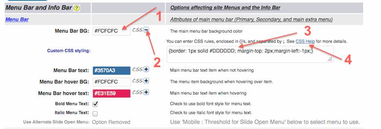
Here is a screen shot of how my Menu Settings are customized, here at My Second Million:
OK, I’m going to ignore the fact that this screenshot looks as if it’s been attacked by Massai warriors on a hunting spree…..
This section of the Weaver Admin Panel follows the same style of all the other Admin Options, of Check Boxes, Color Picker drop downs and CSS+ styling options.
No 1: Menu Bar Background: The main menu bar background color. Again there is the usual Weaver Admin horizontal window that shows the color that has been picked in Color Picker, and the HEX number of that color.
I am using #FCFCFC for this main menu background so it is the same color as the off-white background color of the rest of the page.
You select your preferred color in the drop down Color Picker by clicking in that horizontal bar with your mouse and the Color Picker drop down palette opens up.
Then you select your desired color by clicking your mouse on the area of the square color picker drop down color palette. That color is then displayed in that horizontal window bar, along with that color’s HEX number.
No 2: CSS+ many of the Weaver options have this CSS+ option next to them. If you click on that + sign, a text box opens up where you can add your own CSS style instructions – if you want to, and if you can.
CSS stands for Cascading Style Sheet and is the language of Web designers. You don’t need to know anything about CSS to set up your theme with Weaver II. These CSS+ options are there to cater for the clever-clogs geeks who are fluent in CSS, and like to have fun being smarter than the rest of us.  You will notice that there is some HTML Code added to that top CSS text box. See below:
No 3. Custom CSS Styling: Above the CSS text box it says:
“You can enter CSS rules, enclosed in {}’s, and separated by ;. See CSS Help for more details.”
| {border: 1px solid #DDDDDD; margin-top: 2px;margin-left:-1px;} |
I can guarantee you that I didn’t put that HTML Code in there, which means it must have already been there by default. It is a setting for the border lines that define the Menu boxes. It would be possible to change the Heaviness (px) of the borders and also the color of the borders by changing the px and HEX color here.
I left mine with the default settings because they look fine to me. You do have choice though, like everything else in Weaver Admin.
No 4. CSS Help: If you click on that CSS Help link above the CSS Styling Text Box, you get taken here: to Weaver’s Help pages.
 There you can brush up on your design skills….
 and much, much, more.
All right, going down the list of Weaver Admin Options>Menus, you can see how the formatting and styling box options are consistent throughout the Weaver Admin Panel. No nasty surprises with Weaver.
Menu Bar Text: I have selected color #357A03 to fit in with the overall color themes of the site.
Menu Bar Hover Text: this is interesting. If you hover your mouse over my Main Menu bar at the top of the Page, you will see that the text inside the menu box turns red. Pretty cool, eh? Well it wasn’t hard to do. You simply select the hover color that you want, here in this Menu Bar Hover Text option.
Menu Bar hover BG: This selects the menu item window background, when hovering over the item (the menu text box). I chose to use the same background colour as the background color when not hovering.
This means that when you hover over an item in my main top Menu (not the drop down menu boxes), the text changes to red, but the background colour is the same color as when you don’t hover.
You can play around with these color combinations of borders, background, hover, text etc and come up with all sorts of fancy effects if you choose to.
Bold Menu Text: I have checked this Box for Bold Text in Menu because I thought it looked better.
Italic Menu Text: I’ve left this option un-checked because I thought italic text did not really add anything to my overall menu design.
How to Customize Weaver II Sub Menu Drop Downs
This is the next section down, on the Admin Options>Main Options>Menus panel. You can see that the Weaver Admin Panel is consistent throughout: check boxes, color pickers and CSS styling.
Drop Down Menus are what you see if you run your mouse across my own Main Menu bar. Not all of my Main Menu Bar items have a Drop Down Menu attached (and the Categories drop down menu is still a work in progress).
If you think you will never work out how to include a Drop Down Menu on your site – even the plugins require you to know HTML – check out :
How to Create Drop Down Menus Without Using ANY HTML.
OK, next in your Weaver Admin panel>Main Options>Menus, you will see
Sub-Menu Drop Downs:
No 1: Sub Menu Background: again, I have selected the same off-white color #FCFCFC for design consistency.
No 2. CSS+/CSS – : here again is the option to open a CSS styling window where you can add your own CSS design tweaks if you want to, and if you can.
No 3. Custom CSS Styling: Weaver has added some HTML code for us by default. I didn’t change anything here.
No 4. Again this CSS Help link takes you to the CSS Styling section of the Weaver Help pages.
No 5. Sub Menu Text Color: I have selected a slightly darker blue color text than I have for the Main Menu Bar: #2C5687. Who knows why – I probably thought it was a good idea at the time to add some subtle difference between main menu text and drop down menu text.
Any color choices, or other design choices you make, can easily be changed at any time. You don’t have to worry about getting your design perfect when you start.
No 6. Sub Menu Hover Background Color: here I’ve selected a pale blue color that helps to differentiate the Drop Down menu boxes against the off-white background of the content areas when you hover the mouse over them.
Tip: If you move your mouse over my Main Menu item labeled Time Out! and then move your mouse down over the menu items listed in my Drop Down Menu, you will see how this works in real life – the background color changes as you scroll over the menu items.
Yes, Weaver makes you feel really clever, even if you aren’t very clever at all, really (speaking for myself that is).
No 7. Sub Menu Text Hover: this option controls the color of the sub menu text when you hover your mouse over an item in the Drop Down Menu. I have selected the color: #33BB66 which is slightly less dark than text color in the Main Menu Bar: #2C5687.
This color #33BB66 is also my main blue color I use throughout the Content areas of My Second Million whenever I want to highlight some text in blue.
Bold Sub Menu Text: I have left this un-checked.
Italic Sub Menu Text: I have left this un-checked as well.
How To Customize Weaver II Menu Extras
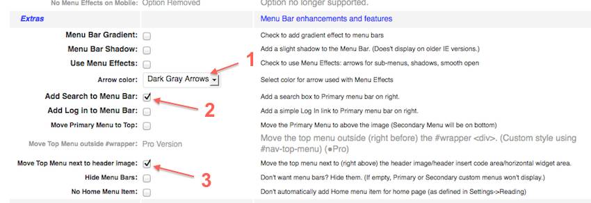
Menu Bar Gradient: this check box adds a gradient effect to your menu. I chose to not use/check this option. But here is where you will find its location if you want to use it.
Tip: check the check box to add a Gradient, save Settings, and check on your web site to see if you want to use this option or not.
Menu Bar Shadow: same deal here. I chose not to add this option.
Use Menu Effects: Weaver explanations says: Check to use Menu Effects: arrows for sub menus, shadows, smooth open.
You can see that I chose to leave this check box un-checked and not use this option. Therefore the following option for selecting Arrow Color that relate to these Menu Effects, does not apply for My Second Million, but I’ll explain it anyway.
Just below the Use Menu Effects (with check box) is a window labeled Arrow Color. You only need to set this option if you are using Menu Effects, which I am not. You will see the text Dark Gray Arrows there (No 1), in the screenshot above. That is because that is the Weaver default option, and you can’t leave this window blank. That is why it is there in the screenshot.
If you do choose to use Menu Effects, your options in that text box are:
- White Arrows
- Gray Arrows
- Light Gray Arrows
- Dark Grey Arrows
- Black Arrows
No 2. Add Search Box to Menu Bar, which I have done. You can see how the Search Box looks when it is added to your Menu Bar, by looking at the far right end of my Main Menu at the top of this page.
Add Login to Menu Bar: I have left this un-checked because you don’t have to Login to gain access to any part of My Second Million.
Move Primary Menu to Top: this option allows you to move your primary Menu above the Header Image, and the Secondary Menu (if you choose to have one) appears below the image.
I haven’t done this, but might think about doing it in future, depending on how My Second Million expands. It might be a useful way to add extra navigation options for readers.
No 3. Move Top Menu Next to Header Image: the official weaver explanation says:
Move the top menu next to (right above) the header image/header insert code area/horizontal widget area.
Hmm…I found out how this option works by Trial and Error (aka the ‘Suck it and See’ method favored by Aussies – yes, we’re a sophisticated lot down here).
I had already chosen to upload an alternative Header Image in (Dashboard>Appearance>Weaver Admin>Main Options>Header (with text added using Mac Preview App before uploading) instead of one of the Header Images supplied with Weaver II.
With you own image uploaded this way, checking this Move Top Menu option moved the menu so it sits right under my header image, even though the instructions above imply (to me  ) that it will be above the header image.
Hmmm (again)….Maybe what those instructions mean, is that it places the menu bar above the horizontal header widget area (which I’m not using) and not the header image itself. That would explain it, probably.
All right, we are onto Dessert.
There are yet more options to play with in this Menu section of Weaver Admin. Including settings for Mobiles, and adding HTML to your Menu bar. There are even more additional options for designing your Menu Bar Layout if you upgrade to Weaver II Pro, which I won’t cover here.
Weaver II Info Bar and Info Bar Attributes
Next down on the list of Weaver Menu Options is…..Info Bar and Info Bar Attributes.
These options include settings for extra page navigation options, and the use of Breadcrumbs.
Luckily (for me, and probably for you as well by now) I’ve already covered these options in the following article:
Breadcrumbs & Web Design: Good, Bad or Downright Ugly?
I’m tempted to smile at the camera, whisk out a perfectly cooked cake, (straight from the oven of course) and say, ‘Here’s one I prepared earlier….’ but I won’t .
OK, all done! Phew! – Coffee’s on the way and chocs are already being shared around…..
Don’t forget to Subscribe to Our Newsletter so you never miss out on the latest news and gossip. Just click on the Subscribe to our Newsletter tab below – it’s easy and it’s free – and check your Spam Folder if you don’t receive a Confirmation email within a couple of minutes.


Pingback: Weaver II Theme: Unofficial User Guide: Index & Links
Wow, I had never heard of Weaver II, after reading this guide I will prove it, thank you very much for all the info
Hi, yes I did a lot of research into Themes before trying Weaver. Weaver certainly does the job.
hi carol,
really nice of u put this help for newbies like me! i was wondering whether u cud show me how to change the color of the current menu item (the page on which the reader is)
that would be a huge favor to me..
Hi Robert, do you mean the color of a Post when seen from the full single article (not an excerpt as seen on Home Page)? If you mean the color of the menu when seen from a full article view, I don’t see how you could do that because the menu is part of the site wide design – seen on all pages and posts.
If you mean the page itself, Weaver has a lot of per page options – and I have not explored any of them, so I don’t know ….but, here is a link to the Official Weaver Help Documentation which is where you will find all the Per Post details.
Weaver Documentation
Also, if you have any questions after exploring the Help Pages, try asking a question on the Weaver Forum.
The colour of the menu item of the currently viewed page can be easily done in two ways.
In the menus option, from Main Option:
Menu Bar hover BG The menu item background when hovering over item. This creates a color block the same size (width) as the menu title.
In addition you can change the color of the currently selected menu item and choose to bake it bold/italics.
This can be done for sub menus as well.
I now use Weaver Pro which adds even more customisation, but Weaver II is the easiest and most solid WP Theme.
Hi carol,
I had little problem with menus. i want to call a secondary menu in some of my pages , i did some and the menu theme is not coming, the menu items are just displaying as list. Please Help
Hi Sarath, I’m not sure exactly what you mean. Can you give us a link to your website so we can see what the problem is? Or a screenshot of your menu that looKs like a list?
Thanks for your replay, actually i want to use different menus in different pages. i have 3 main page,
page1 should contain menu1 only,
page2 should contain menu2 only,
page3 should contain menu3 only,
please help
Hi Sarath, I’m not sure if it is possible to do that. I know the Weaver Theme allows 3 different Menus but I can’t find anywhere where it says how to allocate each menu to a different Page.
You might be able to find some help with this at the Weaver Support Forum. Sorry I can’t be of more help. If you find a solution, maybe you could come back here and tell us what it is?
Thanks for the replay..
Actually it is possible.. i did it. i checked the current pages in nav-bottom.php and the required menu is set.
Well done, Sarath. I’m glad you got it fixed.
hi,
i would like to replace the menubar items, (move the menu items in the
menubar, at place i choose)
how do i manage
vr gr sietse
Hi sietse, I think this article will help you work out how to do that
Check out:
How to Make Drop Down Menus Without Using any HTML