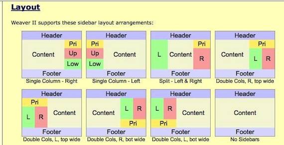
Weaver II is famous for the number and flexibility of its widget areas. The main widget areas that are included in a newly installed Weaver II Theme are as follows: Main Widget Areas: Primary (top) Sidebar, Upper/Right Sidebar, Lower/Left Sidebar (or Left sidebar for multi-column layouts), and 4 Footer Widget Areas. I have only used these basic Widget Areas so far. But there are many additional widget areas for Weaver Theme users to play with.
Weaver II Theme has additional Widget areas as follows:
Mobile Device Widget Area: This widget area provides an alternate area for Mobile Devices. It is displayed between the content and the footer, and uses the same styling as the Primary (top) Sidebar.
Header Horizontal Widget Area: This horizontal widget area is placed right before the standard Header Image. See options on Main Options:Header tab. Be sure to set width for each widget added.
Sitewide Top Widget Area: This widget area appears at the top of the content area on all site static pages and post pages (including special post pages) EXCEPT pages using the blank or iframe page templates.
Sitewide Bottom Widget Area: This widget area appears at the bottom of the content area on all site static pages and post pages (including special post pages) EXCEPT pages using the blank or iframe page templates.
Pages Top Widget Area: The top widget area appears above the content area of pages. It is not displayed on archive-like post pages (archives, etc.).
Pages Bottom Widget Area: The bottom widget area appears below the content area. It is not displayed on archive-like post pages.
Blog Top Widget Area: The blog top widget area appears above the content area of blog pages, including page with posts templates. It is not displayed on archive-like post pages.
Blog Bottom Widget Area: The blog bottom widget area appears below the content area of blog pages, including page with posts templates. It is not displayed on archive-like post pages.
Archive-like Pages Top Widget Area: This widget area will appear at the top of archive-like post pages (archives, attachment, author, category, single post).
The general Layout options are set in Dashboard>Appearance>Weaver II Admin>Main Options>Layout: see Weaver User Guide: Layout.
Location of Widget Area Settings in Weaver II Admin Panel
Widget Areas are customized in Dashboard>Appearance>Weaver II Admin>Main Options>Widget Areas:  If you click on that Help Question mark, the Weaver Help Pages tell you:
“Weaver II separates the sidebar wrapper areas from the sidebar widget areas. The Widget Areas tab controls the background, margins, and borders of both individual widgets, and the different widget areas, including the sidebar widget areas, the top and bottom widget areas, and the footer widget areas.
Widget areas are now insensitive to the border and margin widths – and include an option to specify border attributes in the General Appearance tab. The footer region automatically adjusts widget area widths depending on how many footer widget areas you actually use (from 1 to 4).”
OK, fair enough. I’ll explain how I use these Widget Areas here at My Second Million.
Widgets used Currently uploaded on My Second Million:
Primary (top) Sidebar: on My Second Million I have uploaded these widgets to this Top Sidebar Widget Area are:
- MailChimp Subscribe Form.
- Medium Rectangle Google Adsense Ad (300 x 250 px)
- Text widget for the MailChimp Subscribe Link
- Text widget: Feedburner RSS Feed
- Categories Widget
- Wide Skyscraper Google Adsense Ad (150 x 600 px)
- Recent Posts Widget
- Medium Rectangle Google Adsense Ad (300 x 250 px)
Upper Right Sidebar Widget Area Widgets Uploaded In the Upper Right Sidebar Widget Area I have:
- Archives Widget
- Text Widget: Hostgator Banner Ad
- Text Widget: Facebook Badge
- Links Widget
Lower/Left Sidebar I have nothing added to the Lower/Left Sidebar widget area.
This widget area is located on the lower right sidebar, unless you have selected multiple column layouts, in which case you will see it in the lower left sidebar.
First Footer Widget Area: I have a Text Widget containing ‘Subscribe To This Newsletter’ in my First Footer Widget Area.
There are 4 Footer Widgets available with Weaver. Here is a screenshot of where each one is located:
How To Customize Weaver II Widget Settings.
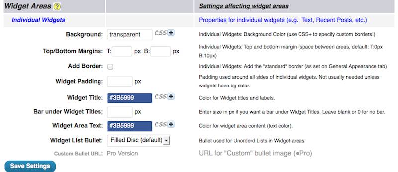
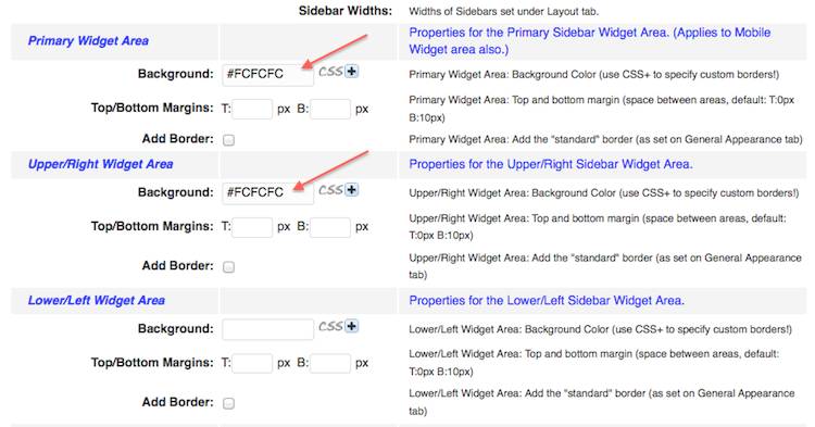
Individual Widgets: this is the first in the list of the widget ares to customize in Weaver admin. I’ve been keeping it simple by setting the Text Colors here, and leaving the other Widget areas with only a background color that’s exactly the same as my Main Content slightly-off-white background color, #FCFCFC.
That gives a clean look to the site, because the content areas and the widget areas have the same background color. if and when I want to change the background color of some of the widget areas later, here is where it is done – in this Widget Areas Option page.
These are the settings I’m using for this Individual Widgets area:
Here is another example of how Weaver is so easy to use. If you click with your mouse in that horizontal color box, a Color Picker menu drops down so you can click on the color you want to choose and that Color, and that color’s HEX number is automatically displayed.
If you click on that Plus sign CSS+ a Custom CSS Styling window opens where you can enter your own CSS (Cascading Style Sheet) Rules if you want to (advanced users).
CSS is a computer language for website design that you do not need to know in order to set up Weaver II and get it on the road, and firing on all cylinders.
Other Widget Areas: The Settings where I have only specified the background color #FCFCFC look like this:
All the other Settings I have left as default.
The Footer Widget areas:
And there is a separate specific Footer Admin Setting found at Dashboard>Appearance>Weaver II Admin>Main Options>Footer.
I have specified the same background color over there as well. I don’t really know which of these Footer background color Settings is dominant but having them both the same makes life easier.
If you look at the Footer area at My Second Million, you will see that I made the background color match the whole site blue outer background color. There is a thin white margin around the blue footer area because I had set the widget background color as the off-whte #FCFCFC in the Main Widget Settings.
If you look carefully, you will see a thin grey border line between the blue of the footer and the white of the Content area. That is because I specified the Footer Border as #E0E4EF above.
I made the Footer text white, and the red Subscribe to Our Newsletter Link by adding the color as HTML of the Text widget itself ( the Subscribe Form Link appears there twice) – once above and once below the white Text on the blue background. I’ve edited the code below to make it less confusing by not including the code for the second ‘Subscribe to Our Newsletter‘ link.
</span></span></span></p>
<p style=”text-align: center;“><span style=”font-size: 24px; color: #ff0000;”><a href=”http://eepurl.com/oo7wn” rel=”nofollow”><span style=”color: #ff0000;“>Subscribe to our Newsletter</span></a></span>
<!– MAILCHIMP SUBSCRIBE LINK // –></p><p style=”padding-left: 30px; text-align: center;”><span style=”color: #ffffff; font-size: 20px;”>If you want to make sure that you never miss out on my latest articles, and my free gifts (a work in progress), Subscribe to my Newsletter and get the My Second Million News delivered right into your Inbox – hopefully not your Spam folder – it’s always a good idea to check….</span></p>
</span></span></span></p>
Impressive for a non-HTML speaking non-geek don’t you think? And I did it, without any knowledge of HTML Code.
OK, I admit that Code above looks like a dog’s breakfast with my ‘color formatting guide’ above – but I’m only trying to be helpful for non-geeks who tend to take fright when they suddenly come face-to-face with a block of HTML code. 
I produced and added that HTML Code to the Footer Text Widget by a bit of non-geek work-around: I opened a New Post ‘Draft’ (not published) and typed out the text that I wanted to put into the Footer Text widget (green text above).
I formatted that text in the View screen (not HTML view) as Aligned Centre in that Draft Post, and specified the font I wanted using the normal visual formatting icons above the WordPress Editing page. I then changed the text color I’d typed in the Draft post to white, using the ordinary Text Color selector in a WordPress Edit Page.
That meant that I could no longer see the white text on a white background page now. But.. then I selected the HTML tab (next to the normal Visual Tab at the top right of the WordPress Edit screen) at the top of the Draft Page. I copy and pasted that HTML code (translated from English to HTML by WordPress) for that already formatted text (white, aligned centre) into the Text Widget I’d loaded into the Footer area.
Then I added the HTML Code I already had for the Mailchimp Subscribe link (from MailChimp) above and below the white text. Clicked Publish….and Ha! Yes it worked!
All the HTML formatting ‘coding’ of text size, central alignment and text color was all done by WordPress itself – I didn’t have to know any Code at all to do that.
I’ve used this method of making WordPress ‘translate’ visual text in English into HTML code quite a few times already. I write and format my text in a Draft Post (Visual view), click to see the HTML view of what I’ve just typed and formatted. Then Copy/paste that HTML code to wherever I need to add it into the HTML view of a Post, or a Widget.
Alright, Widget Areas are done. Next article will be….Header options. That’ll be fun. 


Hello,
Thanks for this post. I found it when I was doing a search under the words:
“side bar widget showing up on buttom left “weaver II””. I was looking for a solution to why a few of my widget jumped to the bottom left side. I made some adjustments yesterday and I must have done something that shifted them. The thing is that I don’t know which of my actions caused that to happen. I am not an html person although I know just a little bit. Any chance you can shed some light here?
Thanks.
Sigal
PS: You have my website and as you can see, the testimonial in yellow as well as the links to connect with me through the social media appear at the bottom left of the page, instead of on the right underneath the “download now” button.
Lower/Left Sidebar (or Left sidebar for multi-column layouts), and 4 Footer Widget Areas. I have only used these basic Widget Areas so far. But there are many additional widget areas for Weaver Theme users to play with.
Hey, it’s me again. I fixed it. Continued searching online and found a way to check if one of my codes was broken. I found that it is usually a “div” that is not complete. I “played” with the “divs” in the code of the specific widget and corrected it. I am so excited.
Here is a site where anyone who has a similar issue can check if there are problems in the code http://validator.w3.org/#validate_by_input
Happy Holidays 🙂
Sigal
Glad you got it fixed Sigal.
I have never had a problem with Weaver widgets behaving badly. Sometimes I’m not exactly sue where a particular widget will show up on the site, but I just add a test Text widget into the widget area in question, and see where it pops up on the site.
Weaver has a lot of widget areas to play with, and I haven’t explored all of them yet. But that method of adding a one word test text widget on the dashboard widget screen, save, and it identifies the location in 2 minutes.
And thanks for adding that W3C link for HTML Code checking – I haven’t needed to do that so far in my blogging, but it’s good to know that it is there.
The main widget areas that are included in a newly installed Weaver II Theme are as follows: Main Widget Areas: Primary (top) Sidebar, Upper/Right Sidebar, Lower/Left Sidebar (or Left sidebar for multi-column layouts), and 4 Footer Widget Areas. I have only used these basic Widget Areas so far.
Hi Panduari, I checked out what you had done on your site – it’s looking good!
Pingback: Weaver II Theme: Unofficial User Guide: Footers
Pingback: Weaver II Theme: Unofficial User Guide: Index & Links