Footer areas are highly valuable Real Estate areas for websites. If you make good use of your Footer areas, It’s possible to add real value for your readers, and for yourself as well. Many site owners don’t bother with putting anything at all in their Footer Areas. This gives a clean look to the page, but it also misses out on potential marketing and internal navigation opportunities.
Yes, it’s true – the footer is right at the bottom of the screen, and readers are allegedly famous for not scrolling down the page more than a couple of flicks of the mouse, at most. But…if you have written articles with great content, and great value for your readers, they will stay engaged.
Engage Your Readers With a Well Optimized Footer Area
Engaged readers are like gold for website owners. Engaged readers will scroll down a web page, and will explore internal links you provide for them. They will go searching within your own site for more leads and more information.and…. in the end, are more likely to buy your stuff.
You can catch the eye/ear/wallet of engaged readers with clever use of your Footer areas. OK, I’ll be the first to admit that I don’t make great use of my own Footer areas… yet. But I do have a Subscribe Form there, to encourage people will sign up to my email list (please do!). Increasing your Subscriber List is an important goal for blog owners, so I am not totally wasting the opportunity offered by my Footer areas. I know I could do much better…so watch this space – oops, watch that space.
How to Customize Weaver II Admin Options: Footer Areas
One of the great advantages of the WordPress Weaver II Theme is that it offers lots of flexibility. Of course it’s other big advantage is that it’s so easy to drive, even for beginners, but the many Options it provides puts it ahead of most of the WordPress Theme pack.
Inside The Weaver II Admin Panel: Footer
All the Weaver Theme Options sections follow the same layout. You never get any nasty surprises with Weaver II. Again, you do not need any design skills. You don’t need to know any CSS (web design language) or HTML Code. All you need is a mouse to set up a website to look exactly how you want it.
Everything in Weaver is customized using Check Boxes and Color Pickers. There is also Custom CSS Styling options for blog owners to add extra styling if they want to, and if they can. I can’t, yet – but still managed to set up my first Weaver II installation in a couple of hours, when I’d only been a blogger for a total of 3 weeks.
The Footer Admin Options are found at Dashboard>Appearance>Weaver Admin>Main Options (1)>Footer (2).
 If you click on the yellow Help Button that Weaver uses throughout the Admin Area, you get taken to the Weaver Help Page that is relevant to the Option you are customizing:
Footer Options:
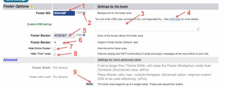
A. Background Color (No 1) this is where you choose the Background Color for your Footer Area. This site is currently using color #244ABF. Those of you that are keeping up will (might) notice that I haven’t used this exact blue color before.
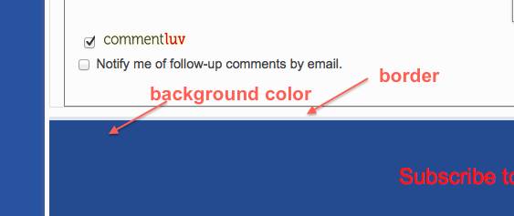
BUT!….. I may have mislead you here (and myself, temporarily). That darker blue color (#244ABF) selected above was the color of my Footer Background before I added a Footer Widget! I currently have a Text Widget filling my entire Footer area, and so the background color of the Footer Widget, is the color you currently see at the foot of every page.
The Widget section of Weaver Admin also has some options related to your footer area. You can see the Guide for the Widget Areas here: Weaver II Unofficial User Guide: Widgets.
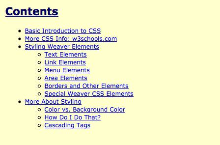
B. CSS +/- (No 2) this is the standard Weaver Custom CSS Styling option you will find throughout Weaver Admin. If you click on that + sign, a text box opens out (No 3) where you can add your own CSS styling if you want to, and if you can. You do not have to add anything here. If you want to learn a bit about CSS (Cascading Style Sheets), just click on the CSS Help link (No 4) and you get taken here:
B. Footer Border: (No 5 above and Border below). This option is where you select the color of the border between the Footer Area (or Footer Widget area) and the Main Content area of your blog.
I have selected a mid grey for the border (#E0E4EF) to soften the edge between the Footer and Main Content area.
C. Footer Border: Width (No 6 above). This is a check box where you add the thickness of your border in Pixels. The best way to know how many pixels look on the page is to change that number to, say 10 pixels, save, Refresh, and see what that looks like. I have a setting of 4 pixels.
D. Hide Entire Footer:(No 7 above). I have this option unchecked. Therefore this site does show a Footer Area.
E. Hide ‘Final’ Area (No 8 above). OK, I’m not sure how this option works. I tested it by checking this box and seeing what happened: nothing happened.
That’s probably because I don’t have any ‘script or plugin messages at the bottom of my site’. According to the Weaver Admin blurb here, this option:
‘Hides the display (but NOT functionality) of script and plugin messages at the very bottom of your site’
Hmm. I will have to get back to you on that one.
Advanced: these options are available to users of the Pro version of Weaver II, so it is not covered in this user-guide. However, there is an extra Note here (No 9 above).
Note says: ‘The Footer area supports up to 4 widget areas. These widget areas auto-adjust their widths’.
I can add, that these Footer Widgets auto-adjust across the entire footer area, and their individual widths depend on how many Footer widgets you add to the footer area.
For more on customizing the Widgets in your Footer area, see Weaver II Unofficial User Guide: Widgets.
All right! We are on the last lap!
Site Copyright: (No 1). Weaver theme comes with default Copyright message for the very bottom of the Footer Area, under any Footer Widgets you may have added.
This is the footer Site Copyright Message from my other blog, because it shows the original default message.
The advantage of retaining this default Copyright message is that it automatically updates every year. Also, if you retain the default message you don’t have to use any CSS, which for people not fluent in CSS, this is a considerable advantage.
But if you are a clever-clogs geek who is right at home with CSS, then Weaver tells you should write your own message (No 2) and:
‘Use © to display ©. You can use other HTML as well. Use   to hide the copyright notice’.
I think I could actually do that (with a bit of experimenting), but I won’t. Because I don’t need to, or want to, and don’t want to have to remember to update the Year every year. But if you want to use this option, here is where you do it.
Hide Powered By: (No 3) if you wish to, you can check this box to hide the ‘Proudly Powered By WordPress: Weaver II by WP Weaver’ message.
Footnote: for those who are fluent in HTML, it is possible to add other content to the Footer from the Advanced Options HTML Insertion tab.
Of course, you will probably know by now, that HTML is still a foreign language for me, so I won’t be trying to explain all the extra Advanced Options that are available with the Weaver II WordPress Theme.
But, for all you HTML wizz-kids, Weaver has a lot more options for all you advanced geeky types to play with.
THE END! …for now!
A big plate of chips all round, please, Gladys – and get them while they’re HOT…
Don’t forget to Subscribe to this site by signing up for our Newsletter – it’s easy and it’s free! Just click on the Subscribe to Our Newsletter below, and never miss out on updates and gossip. How could you possibly resist!


Pingback: Weaver II Theme: Unofficial User Guide: Index & Links
This is all very well, but I still don’t know how to stick the footer to the bottom of the page so that content which is longer than a page, flows underneath it. Or if it’s shorter than a page the footer is still at the bottom. ‘Sticky footer’ I looked up elsewhere on the Weaver Forum seems to concern situation where you want the footer to be ‘stuck’ at the bottom of, say, 5-pages-long content, which is not what I want. Behavious I want is best described on a page such as http://www.vildefrang.com.
Hi Christopher,
I’m trying to understand your problem, so if I’ve misunderstood what you want, let me know:
First of all, a Footer is the section of a website that is underneath the content areas. It is part of the website design structure, and therefore does not change when you change pages or view a different Post.
In Weaver and other WordPress Themes, the Footer is where you can add Widgets, as you do to put Banner Ads etc into sidebars.
Below the Footer widget area, is the thin Copyright etc line. In Weaver, and most WordPress websites, you can choose to show this info or hide it. It is controlled in the Theme’s Admin Footer options and does not involve added Widgets.
In Weaver, you can also choose to add text (including links) into that Copyright etc space, using HTML. This would be an ‘advanced’ design job because you would need to know HTML to do it.
That site you mentioned does have a Footer, but no widgets added. Therefore it only shows the very narrow Copyright etc strip. They have added extra links into that thin strip, presumably using HTML It contains the Copyright, Credits, Facebook Link, EMI etc.
In Weaver, you can have up to 4 Footer widgets. My Footer contains only my Subscribe information in one widget.
Suppose, you are not talking about that thin strip at the bottom of that site:
Suppose you want to know how to have only a few paragraphs of Content text in Posts and Pages, (as in my Home Page) and have a line of text like: Continue reading.
So that when you click on Continue reading, you get taken to a ‘new’ version of the Post which is the full version of the post.
You do that by going to the HTML version of your post (next to the ‘Visual’ option in the WordPress Edit screen).
Then you decide where you want to make the switch/break from shortened Home Page view to the full Content version of the post.
Place your cursor where you want the break, and click the ‘more’ link in the row of HTML formatting buttons across the top of the HTML version Edit screen. Update. All done.
Do you know how to insert navigation into the footer in Weaver II? I see that you have all the basic stuff but the footer is REALLY limited and I can see where I can get a snippet or code to put in a menu or navigation into the footer.
Lynn
Hi Lynn, there are up to 4 widget areas available in the Weaver Footer options. Which means you could put one widget, for example Table of Contents which you should find in your Widget area.
Or you could put up to 4 different widgets into your Footer – for example choose from: Recent Posts, Recent Comments, Categories, Pages, Archives etc.
I checked the CSS Snippets in Weaver Admin: Help pages, but couldn’t see any that related to your question.
If any of the above suggestions doesn’t solve your problem, I suggest you should ask over at the Weaver Forum. They are experts in CSS and also built the Theme, so they should be able to help you.